We’ve seen designers take kids’ rooms in a million directions, from arcade themed to outer space inspired, but no matter how imaginative the jumping-off point is, there’s one thing they almost always have in common: longevity. This was top of mind for Urbanology Designs founder Ginger Curtis and her team when they set out to turn an empty, open space at the top of her Dallas-based client’s stairs into a playroom. The area had to feel suitable for the couple’s daughter, Nico (4), and son, Smith (6 months), but it also had to be able to function for the family as their little ones grow up and transition into their big-kid and tween years. Plus knowing the spot is visible from the ground floor, it had to flow with the rest of the house. “We wanted people coming over for a dinner party to glance up and be like: What an incredible space for the kids!” says Curtis.
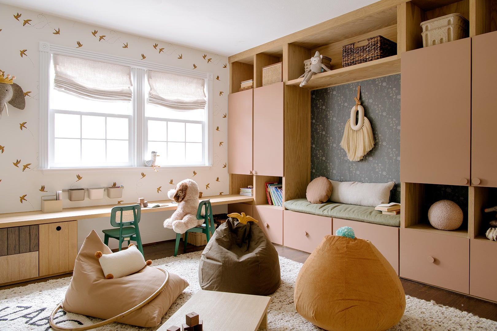
Considering it’s a circa-1900 Tudor-style house, the place didn’t boast a lot of storage as it was, so Curtis and her team sought to introduce integrated options that could adapt to the changing needs of the young family. That’s how she ended up with a full wall clad in a mix of drawers, cabinets, and cubbies for toys, blankets, puzzles, and miscellaneous crafts (and there was even room left over for a bench). “It was a great opportunity for a beautiful design moment but also to give them the functionality that they were really missing,” notes Curtis. Painting it a pink-mauve hue dubbed Moroccan Spice by Sherwin-Williams sealed the space’s balance of playfulness and sophistication. Read on for four more ways Urbanology Designs ensured both the play zone and Nico’s bedroom would endure the test of time (or at least the next 15 years).
Mix Wood Tones
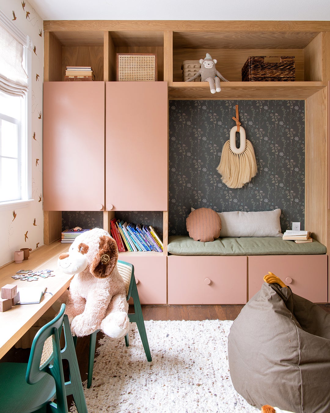
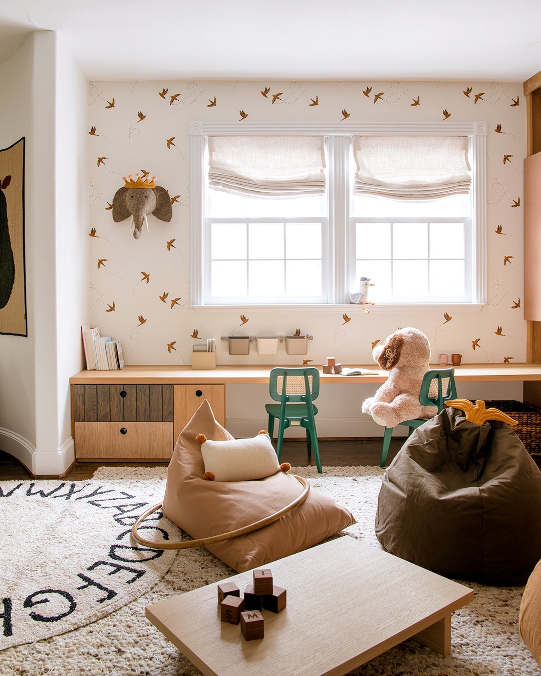
Curtis and her team kept the oak millwork going around the playroom in the form of a long worktop that, these days, can be used as a drawing or Play-Doh station, but once the kids are kindergarten age, it can pull double duty as a homework spot. Curtis and her team went with a mix of wood tones for the under-desk cubbies for an elevated alternative to typical primary-hued playroom desk designs. “It feels appropriate for a children’s space, but it doesn’t feel kitschy,” she explains. Theoretically, when Smith and Nico are older, the desk could be removed and a large sectional could be brought in to turn the landing area into a movie-slash-hangout zone.
Don’t Let Tight Corners Go Untouched

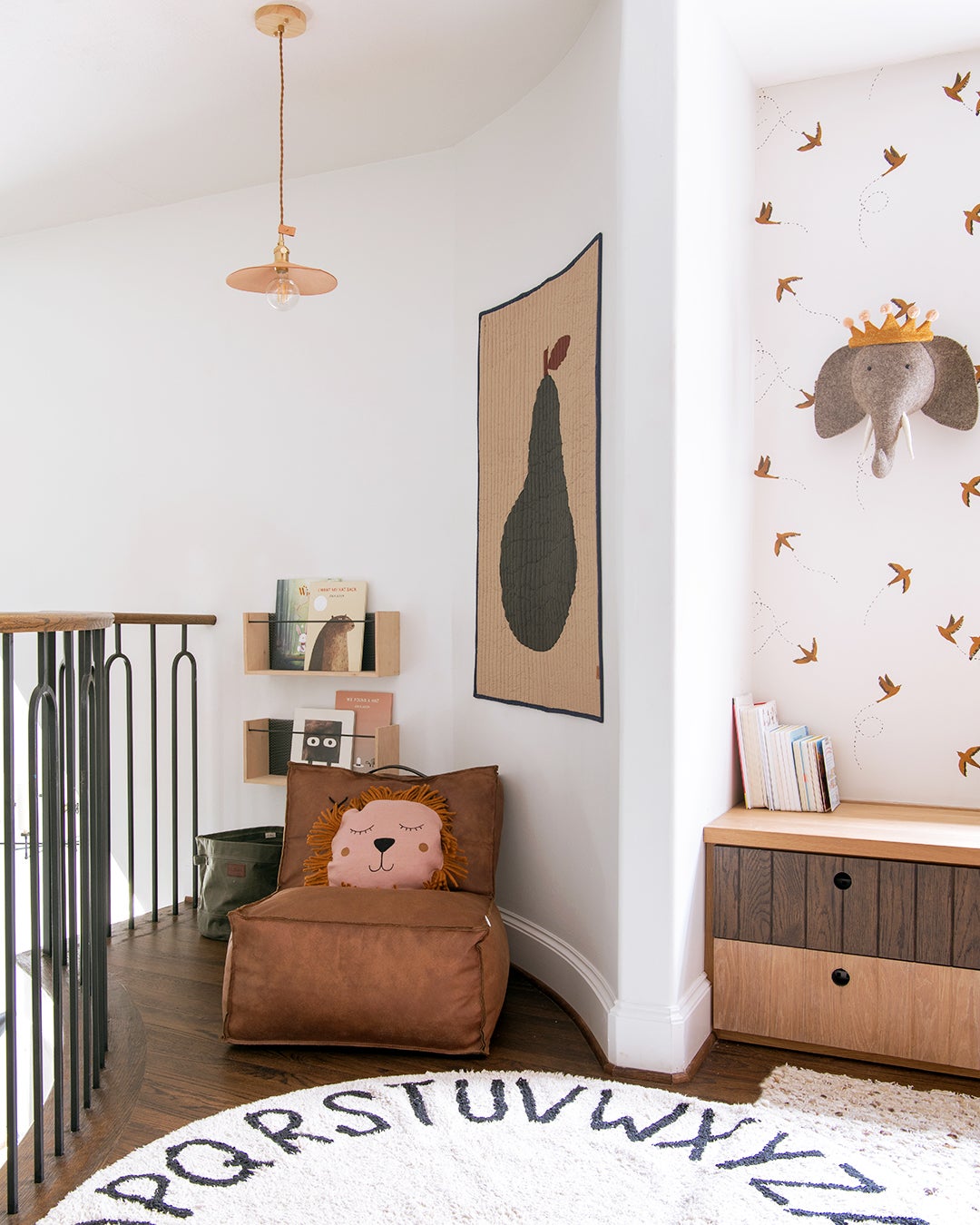
The bonus, curved nook by the railing was too small for the designer to place more storage, but since it is visible from the ground level, it still needed something. What better way to take advantage of a quirky niche than to designate it as a little library with a comfy leather lounge chair, shelves, and a cozy tapestry? “Throwing a beanbag in that corner would have been really easy,” says Curtis, “but we realized we could create a special moment in a spot that otherwise might have been easily forgotten.”
Forget Under-the-Bed Bins
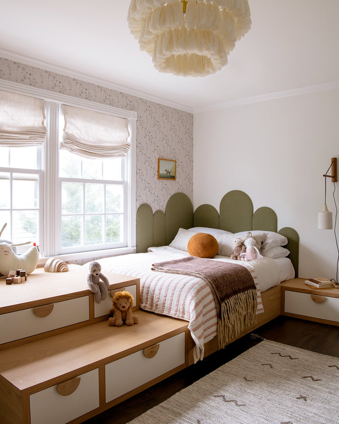
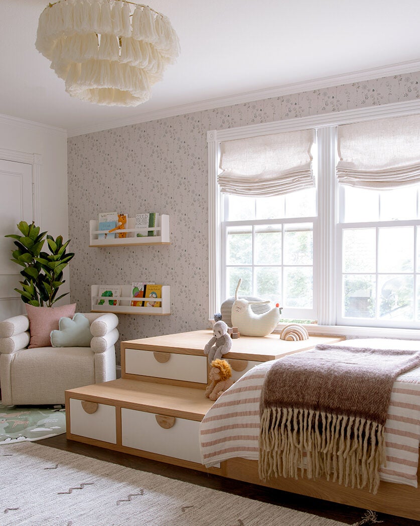
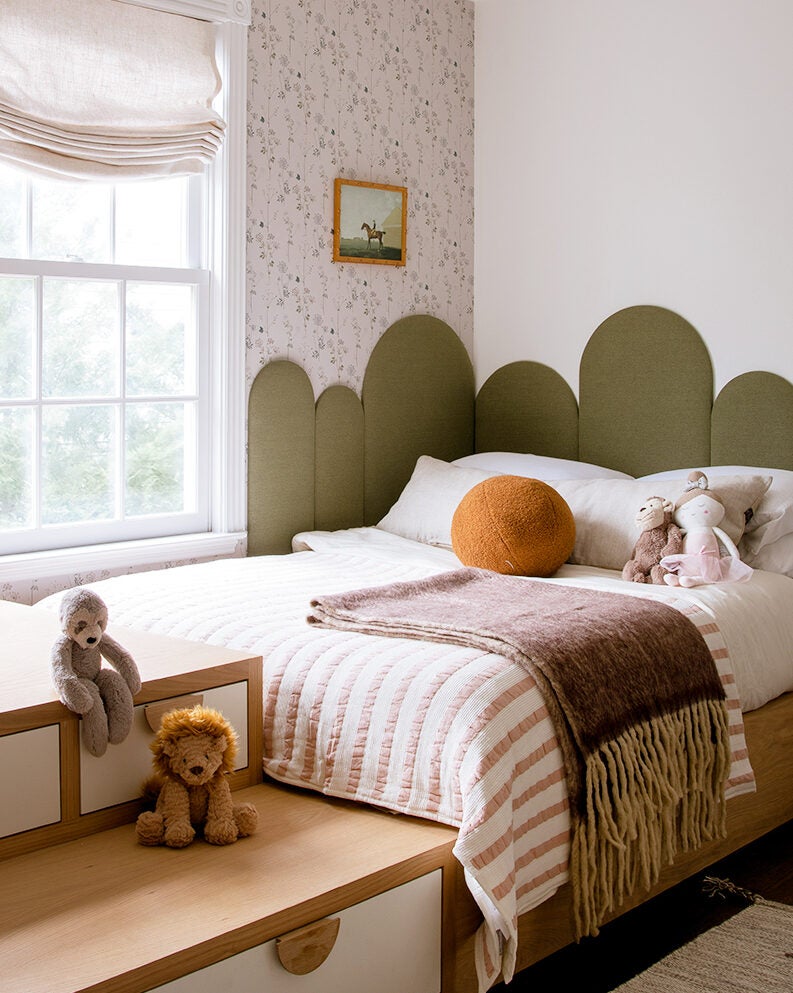
One of the reasons Curtis loves creating custom built-in beds for kids’ rooms is the sheer uniqueness. “It’s not something that exists elsewhere; none of her friends are going to have it,” says the designer. In Nico’s case, it’s a structure that merges play, sleep, and storage. The tiered platforms feature four drawers within them, offering a spot for clothing, while the 4-year-old can treat the wide steps like a jungle gym and play with her stuffed animals and blocks on the ledges. The ultimate flex is the full-size bed, which means Mom and Dad won’t have to tear it out and start again when she grows. The L-shaped headboard adds a touch of whimsy to the boxy structure with its varying archways.
Teach Them Lessons Without Them Even Knowing
While the bespoke millwork in both spaces was no small expense, Curtis and her team saved on the smaller accessories. “You don’t need a fancy rug for a kids’ space,” she notes. The two round ones she layered in Nico’s room and the play area encourage learning (one features all the letters in the alphabet; the other is a map). She peppered in other friendly characters and images, like a felt elephant bust, beanbags that are shaped like pears, and bird wallpaper. “Clearly those are items that wouldn’t go anywhere else but a children’s room, so it helps to bring a bit of that whimsical vibe to the area,” says Curtis. While you can’t be young forever, these tiny touches make the most of the precious time.
The post Pink Cabinets and Pear-Shaped Beanbags Turned This Top-of-Stairs Space Into a Chic Playroom appeared first on domino.
