In our Ask a Shopkeeper series, we tap the coolest store owners we know for a tour of their space and ask them what items are trending right now—and beyond. For this installment, Monica Navarro, the owner of Los Angeles’s Atwater Village concept shop Dreams, shares the inspiration for the store’s experiential-focused interiors, including the piece of not-for-sale decor that customers are constantly asking to buy.
How did Dreams come to be?
The new landlords at my first store, Individual Medley, served us a 30-day eviction notice, essentially saying: “We want to take over the space and we want you out now.” So we had to make the really sad call to close, because in my heart I just felt like I couldn’t do another Individual Medley. It had served its purpose in that space and for that time, and I was ready to start something new.
So that springboarded this new project. I took a few days to process and decided that it was time to go in a fresh direction and try something different—I wanted to bring something unique into the world. That’s where the concept of Dreams started.
How did you come up with the shop’s name?
I wanted to break away from what we were already doing. To have a change creatively, energetically, visually, and do something totally different. And so within that, we were brainstorming how that looks in the retail world now. What are people wanting in a retail space? Especially with a pandemic, especially with all the pressures of life in the 2000s—the stress of, like, even leaving your home. To me, if you go out, you want to have an experience; you want to have something more than just a regular shop to walk into. You want to feel something; you want to evoke something.
From that thought came the idea of dreams, or moving through dreams. And that’s where the origins of the name stemmed from. The very first name I thought of was Dream Shop, and then it came down to just Dreams in the end.
What was your inspiration for the design?
When we were brainstorming our next steps for what type of retail experience we wanted for ourselves—just putting myself in the shoes of a customer and thinking what experience I wanted to have when I visited the store—that really informed what we pushed Adi Goodrich, our designer, toward: creating a space that felt like an escape. That is why we wanted to focus on creating different areas of the store, so it felt like you were traveling through different realms or dreams.
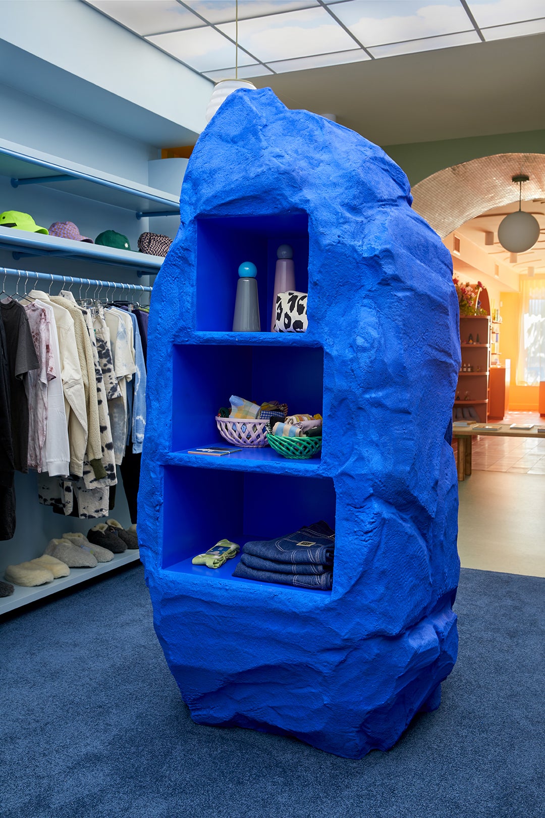
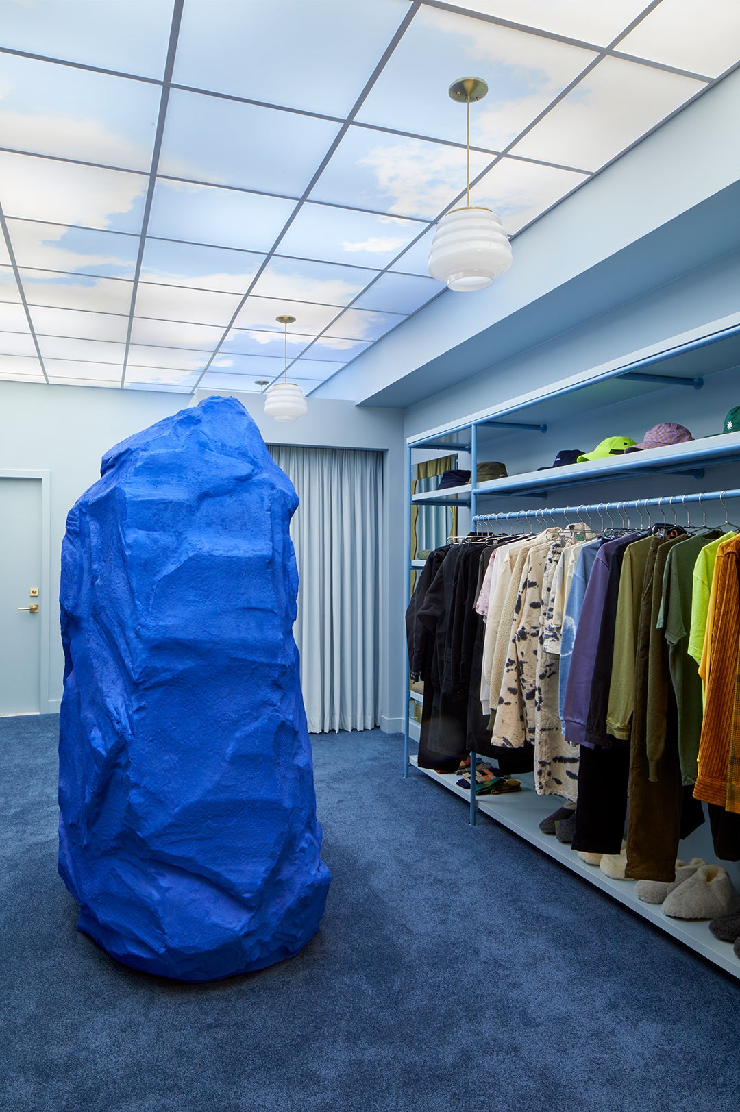
We were also very inspired by the Surrealist movement and Surrealist art in general. And creating a fantastical fantasy—worlds within worlds. And that is where we have some of the playful elements within the design, like the monolithic blue rock and the cloudy sky within a building. Those elements are very much pulled from the Surrealist movement.
Any favorite Surrealist artists or artworks?
There were a few that we referenced and personally love. I love Vladimir Kush and Salvador Dalí. I am having a major crush right now on Frida Kahlo, but it could also be that I just visited her house in Mexico City a few weeks ago—it’s just so magical. I mean the whole Surrealist artists’ movement is very inspiring to us.
And I was also inspired by the artists whom we work with currently, who did a lot of the branding for Dreams. We used Julia Dufossé, who is an amazing artist. She makes these really interesting illustrations, and she did some for the store. Our designer Elena Schlenker. Moira Quinn, the woman who designed our incredible rug that is behind our cash wrap—for which we used an illustration by Clay Hicksson of a pearl floating over a pond. All these styles are inspired by the Surrealist movement. So I think a lot of elements within our store are nods to that period of art.
Tell me about your relationship with designer Adi Goodrich—what is the process like with her, and how do you two collaborate?
I originally met Adi through Individual Medley. She came into our store when she first moved to Los Angeles. That’s how I became aware of who she was and started following her artwork. And I just became a huge fan of her spatial design. She does music videos, photo shoots—all of it is the most interesting, the most creative, inspiring work I hadn’t seen before.
So I approached her to collaborate with us on Wine + Eggs, just out of being a huge fan of her work. I was really nervous to email her, but she accepted the job, and it’s been an amazing, amazing roller coaster ever since. I think our styles are very symbiotic. We’ve worked together seamlessly. We’re always bouncing ideas off each other and being open to trying all sorts of crazy things.
It’s a really wonderful working relationship and one filled with nothing but trust, and that’s why I want to work with her. I love her style. I love her way of thinking and the way she looks at worlds and creates them.
How did you choose the colors you used in the space?
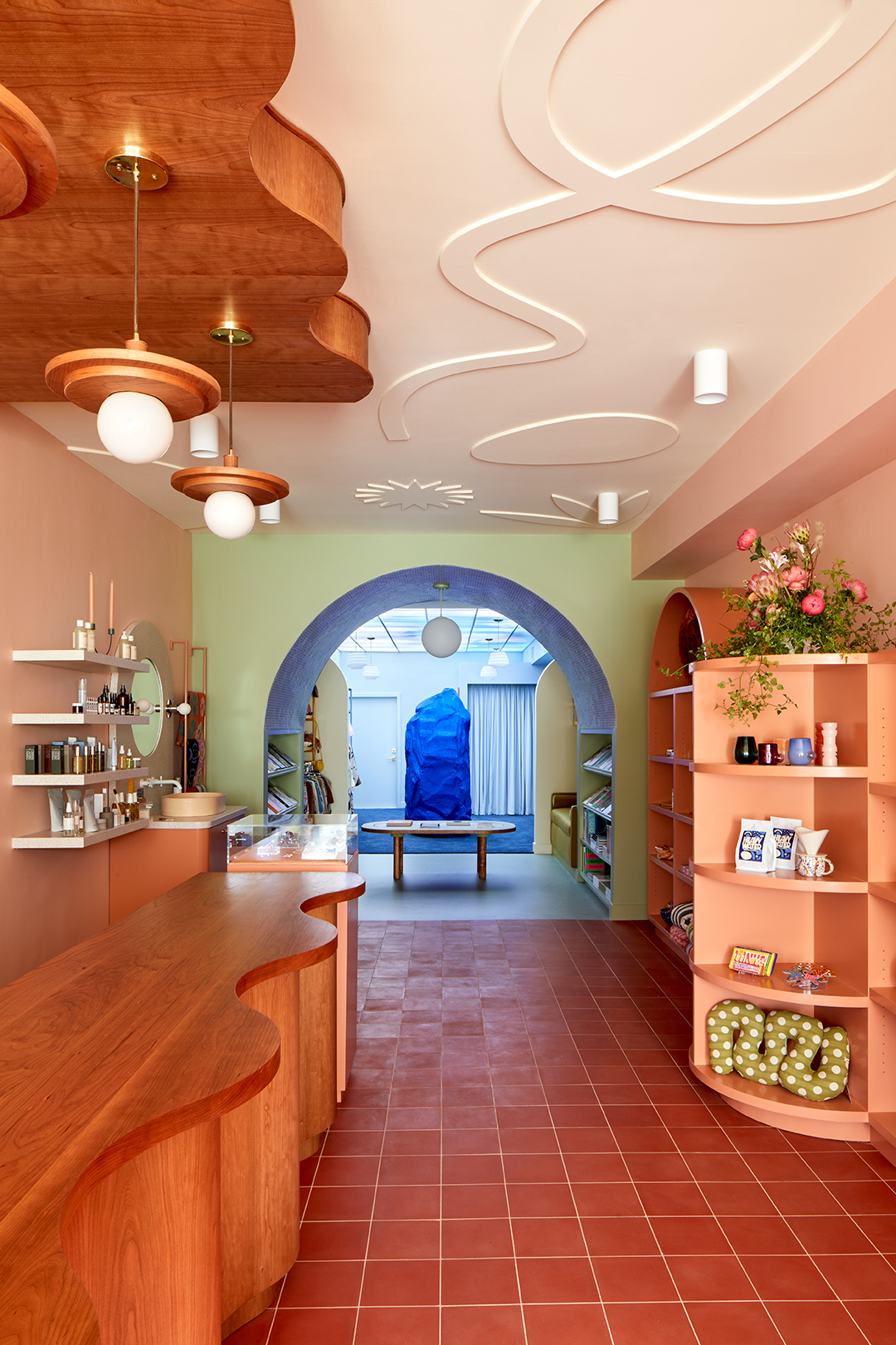
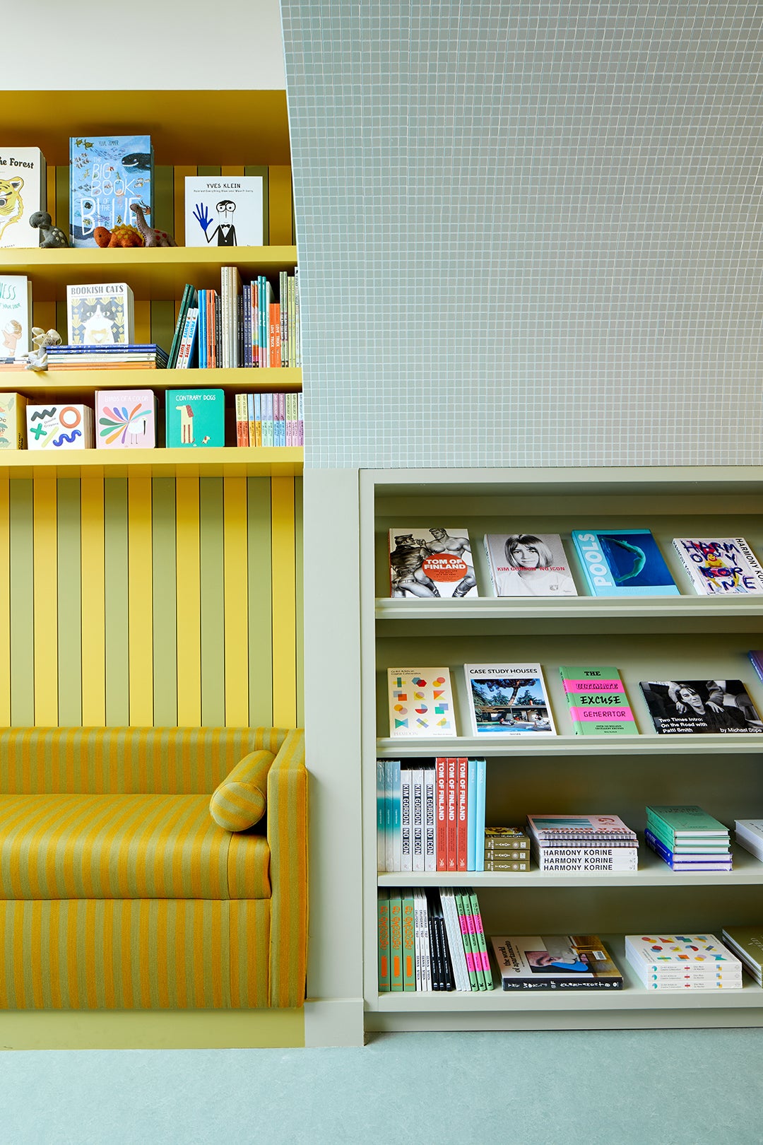
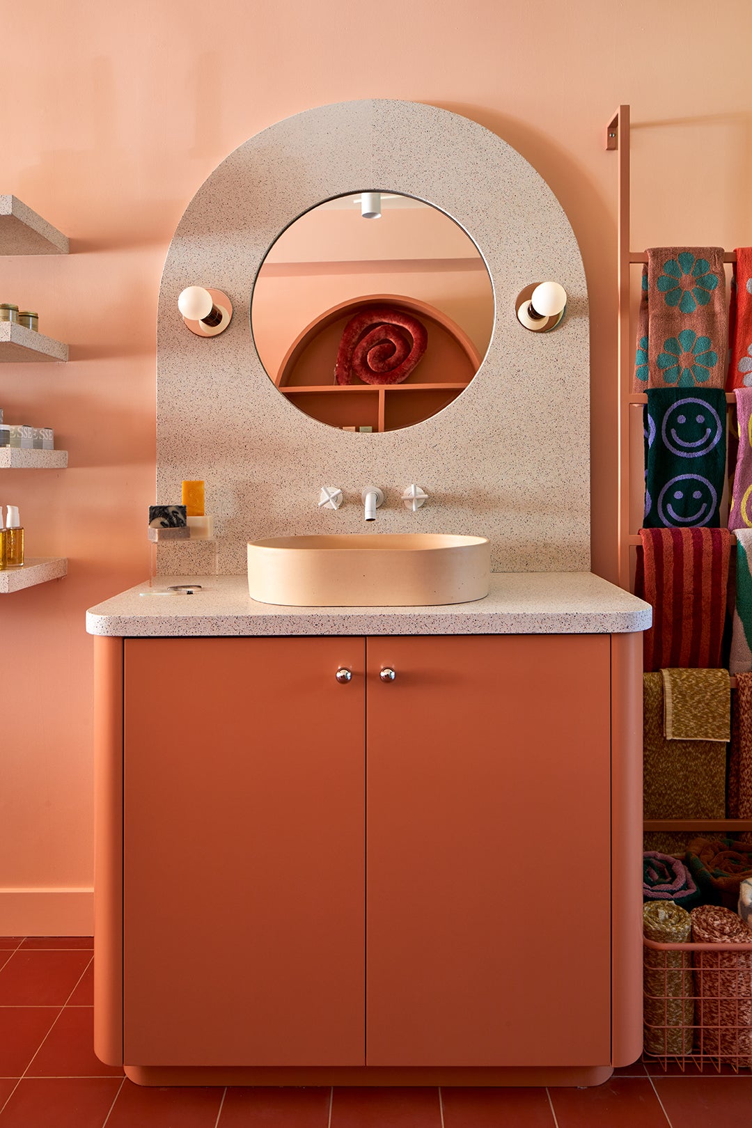
Adi is a color wizard. We wanted to make each area of the store feel as if you’re traveling through different realms. And we all decided that the best way to make that happen was through color and texture. So the store is broken into three to four-ish areas, and they’re all composed of very different textures and colors. You walk in and you’re just engulfed in this warm terracotta-pinkish hue that is very soft on the eyes—very soft and warm. And then you move to the next section, which is green tile that engulfs you in this little arch, and the floor is green Marmoleum. So it’s a different floor from the floor you were just on. And then you continue walking into a green-and-yellow–striped space that’s really fun and really playful—that’s the children’s area. It kind of reminds me of a circus tent. And then you move on to this plush, dark blue carpet, and you’re in this blue area where there’s a blue sky and a blue rock. It really makes you feel like you’re walking through different spaces and each space feels unique, and the layout makes you want to keep walking.
What is your favorite design element in the store?
When I’m there, I want to keep walking to the giant blue rock. I lay down on the soft blue carpet and stare up at the sky—it’s just an immersive feeling in there. The first thing my daughter did the first time she visited was run to the blue rock and hug it. And I was like: Yeah, I’m drawn to the rock, too.
What design element are customers most drawn to?
I would say everyone is drawn to the big blue rock at first, and then they take it all in—the sky, the carpet, the archway, the curvature of the cash wrap. But when I’m in there, people come up to me and they’re like, “Is this for sale?” They want the blue rock.
You stock a little bit of everything—from home decor and personal-care items to clothing and even goods for kids. What do you look for when deciding to bring an item into the shop?
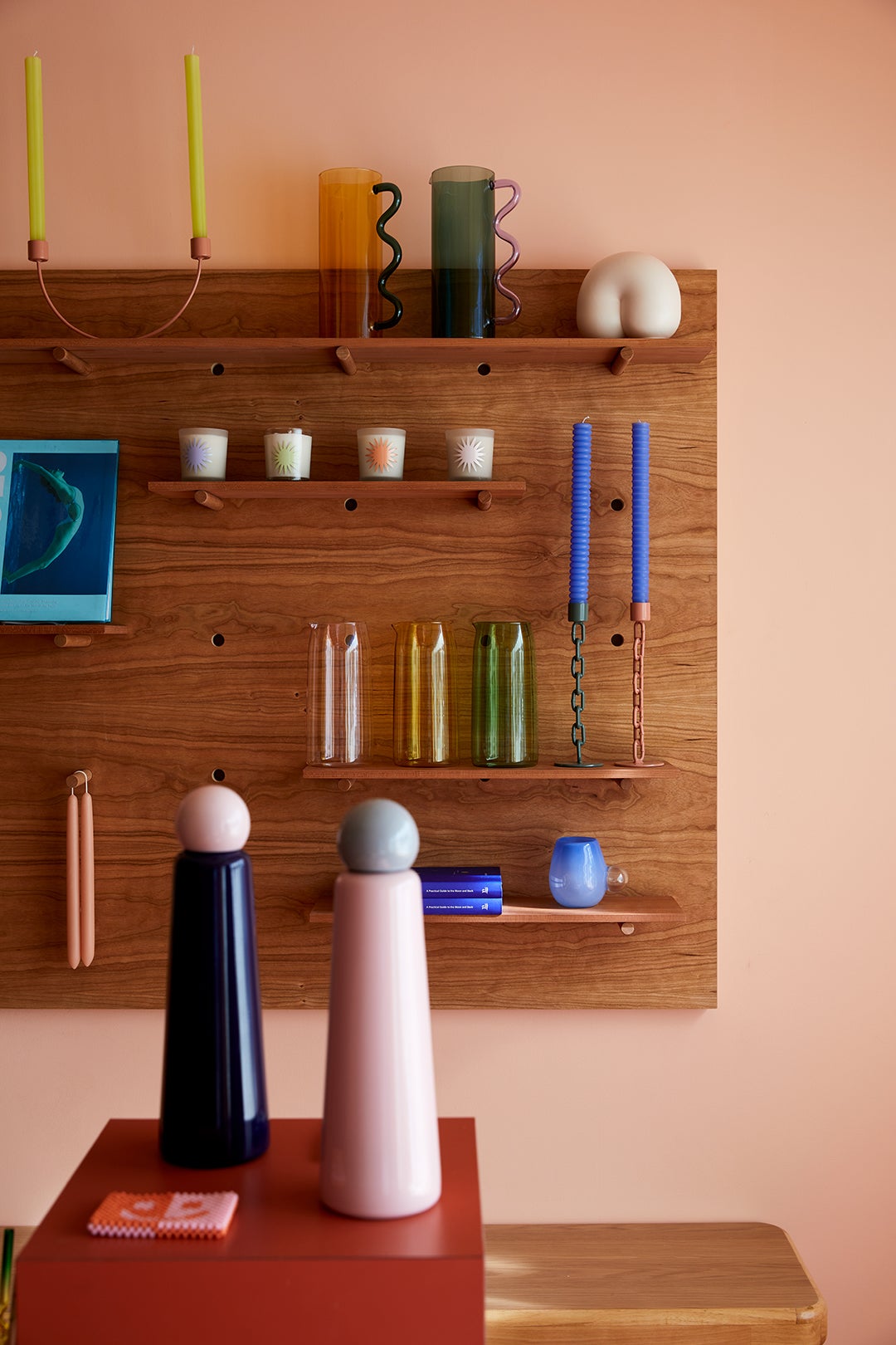
We really try to focus on products from emerging artists. Brands that have a combination of great design or sustainability. And quality, of course. I am always looking for local or U.S.-made, smaller indie designers. We love anything with a little bit of fun and humor—that always draws me in.
Shop Talk
Music that’s always playing in the store: We like to keep it really mellow, so we play a lot of friends’ music—Kacey Johansing, Johanna Samuels, Boardwalk, our friends Mike Edge and Nico Yaryan.
Instagram account I go to for inspiration: @animalsdoingthings is one of our favorites.
Dream person to walk into Dreams: Bad Bunny—I’m a huge fan of his music.
Favorite nearby shop that’s not my own: Out of the Closet, which is the awesome thrift store on our block. All of us are always finding cool things there. There are employees who go there on their lunch break—every lunch break.
Favorite nearby restaurant and/or bar: I have a few because we have so many good ones. Tacos Villa Corona—it has a $5 breakfast burrito and was on Anthony Bourdain’s The Layover. It’s so delicious. Proof Bakery is also on Glendale Boulevard—really great coffee, really great croissants. And for happy-hour drinks, Club Tee Gee—it’s a really cool, old-school bar and it’s awesome. All of these are on our block.
Favorite item in stock right now: The Meals’ Chef Pants. I wear them almost daily. They’re the most comfortable pants ever. They have these huge side pockets and an elastic waistband. I feel superhip when I wear them, yet they’re extremely comfortable—I’ve been living in them.
Domino’s editors independently curate every product on our site, because we’re just as obsessed with a great deal and an under-the-radar discovery as you are. Items you purchase may earn us an affiliate commission.
The post Visiting L.A.’s Coolest New Shop Feels Like Stepping Into a Surrealist Painting appeared first on domino.


